Vector vs. Raster
When it comes to having a design print or display on screen well is image quality.
In the big picture there are two kinds of files. Vector and Raster. Depending on what you need to do both have their pros and cons.
Vector

Vector files are line drawings. They contain no resolution because they aren't based on pixels but based more on mathematical curves. Therefor, they can be shrunk to business card size or enlarged to a sign the size of a building with out losing image quality. This makes them ideal for logos, icons and graphics. With editing software like Adobe Illustrator they can actually get quite complex too with various shading tools now available. Whenever possible logos should always be done in vector since it makes them universally usable. Promotional products, vehicle wraps and signage almost always require artwork in a vector format and is highly preferred for every other use too.
Common Vector File Formats:
- EPS - Most Universally Accepted
- AI - Adobe Illustrator
- CDR - Corel Draw
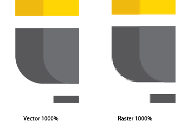
Special mention: PDF - Adobe Acrobat. *This can sometimes be vector. If you don't have any of the above then this is worth a look for as a lot of designer will send proofs in PDF that contain vector images which a skilled designer can most of the time pull out of the file and convert to an EPS for universal use. You can test whether it's vector by really zooming in on the logo or element you want to check and if at, say 1000%, it's still crisp then you are probably looking at vector art.
Raster
Raster files are based on pixels. The quality of a raster file is determined by pixels per inch (PPI). Raster images are more rigid to work with when creating a quality piece of artwork. If the image resolution is too low then the image will look blurry or pixelated (you can see the square pixels). On screen you need an image resolution of 72 ppi. For print it's ideal to have your image be atleast 300 ppi in most cases, especially if that piece will be looked at up close like a flyer or brochure. If the image is a good quality photo to start, sometimes you can get away with slightly lower DPI. If it's being printed very large for a sign or vehicle wrap then lower is more acceptable since the viewing range tends to be further away for signs and wraps (as opposed to a brochure 15 inches away from someones face). I've seen files go as low 50 DPI to be printed on the side of a transport truck and they looked great when standing a few feet away. There are many types of raster files.
Common Raster File Formats:
- JPG - Most common. Not program specific
- PNG - Alternative to JPG. Can have transparent background. Most used for on screen as it can only be RGB formatted.
- GIF - Can be used for low colour range graphics on screen. Can also be animated.
- TIFF - Loss-less image. Every time you save a JPG the image quality gets lower, but TIFFS don't lose their quality. Mainly associated with Photoshop.
- PSD - Photoshop Document. Photoshop documents may contain vector elements but they are generally a raster file.
- and a whole lot more!
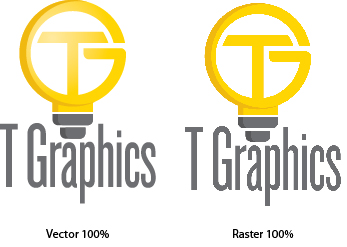
Example:


A final note. Always get your logo from your designer in vector format if possible (some logos are only done in a raster version) but if possible have it done for vector too. It's an important file to have and can save you money down the road from not having to pay other designers to redraw it over and over again. If you do have a logo that is not vector let us know and we can discuss redrawing it for you. We supply you multiple formats for different uses.
And as always if you found this helpful at all please rate the post with a star. Till next time...

