Author: Tom - T Graphics
Minimalist Movie Monday – 6
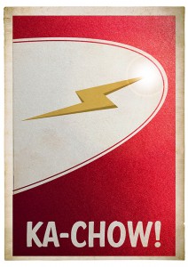
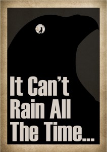
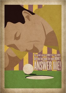
To start the week off again, here is a poster for one of my favorite movies.
I've watched it many times growing up when it was on The Movie Network and a few times recently on Netflix. Enjoy.
As always let me know what you think with a star rating below 🙂
Don't Steal Images! (Where to get images)
The idea for this post came when I saw a post on Facebook last week about a copy-written photo being used by someone who did not have permission to do so. The Ottawa photographer somehow came to realize that her photo was being used in some sort of promotion by the larger Ottawa company and was upset on two levels; one because they didn't have permission, and two because she didn't like the content associated with her photograph. She has since taken up a Facebook campaign to spread the word of the injustice she's felt from the company. She contacted them in regards to the image use and was treated respectfully and apologetically at first. They said they apologized for the incident and assure her it was a small sales tool that was never used publicly but only in fewer then a dozen private meetings. They then asked what she felt was fair compensation. This is where the tone changed. She expressed that she wanted a specific amount of compensation and would not budge on the issue. They responded with what they normally would pay for an image and it got heated from there.
I specifically didn't want to use the exact details because I'm not writing this to add fuel to the fire of the specific feud going on between those two companies. Acquiring images is a necessary part of any design but professionally and for personal uses. You must be careful in where you get your photos though.
Where not to get images
Google Images (and other search engines)
Google Images is not a online store or market place for photos. It is a data base of images that are on the internet that Google has made easily searchable. The images are generally owned by someone else and can not just be used freely. There for I can not use photos supplied solely from a Google search in my designs. If a client sends me some images they found on Google, I kindly explain that we don't have permission to use them but we can look for similar images on stock photography websites.
However that doesn't mean that Google can not be a tool in finding the right image. Many stock photos do show up in Google either from the stock site itself or someone else has purchased that image for their site. Most times I can generally track down a purchasable image. If it's custom photograph not for stock use it's a little trickier but with Google's find similar images it can help find a purchasable image.
Other people's sites
This is generally the same as taking from Google Images but a more direct route. Unless someone has given you permission to use something from their site, then you can not use it. If I am told by a client that they have been given permission to use it then I explain that they are responsible for the use.
Where to get images
Stock Image websites
The cheapest and easiest way to find multiple images for use is a stock image website. Dreamstime.comm and iStockPhoto.com are among my favorites. Here you can search through images that are purchasable at a fairly reasonable rate for professional use. The normal license will generally grant you use up to 100,000 copies.
Free Stock Image sites
There are some sites that offer a limited number of photos for free. Dreamstime.com has a free section, Stockfreeimages.com (seems to be associated with Dreamstime in some way) and while I've never checked it out for my professional use I'm told Wikimedia Commons has images for use as well, however I recommend checking the license agreement on any photo you wish to use.
Hire a Photographer
I would imagine with the dawn of the internet this practice has gone down quite a bit but it is a really good way to get an exact shot of something you need. Stock photos can be great but finding the right one can be very difficult if you have a very specific need. This is where hiring a professional can be a life saver. Different photographers may have different areas of expertise; for example if you need food photographed you may want to research a photographer who knows that particular skill set as food can be very trick to photograph in an appetizing way.
Final thought
For professional things I recommend the above tips. Personally though I feel that if something is not being used publicly and is for internal or private use the area is a little more grey. I wouldn't expect an intern or general office personnel to spend money on an image for the office Christmas party or to put on the office hockey pool sign up sheet. But be careful when using images on anything. Sometimes it is easier to ask permission then to ask forgiveness...
As always let me know your thoughts...
P.S. Sorry for lack of images. Kind of ironic... don't you think?
Minimalist Movie Monday - 5
Today marks one month since re-launching. Thank you all for your support.
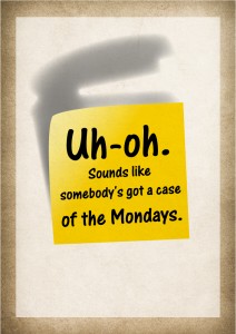
This is the 5th poster I've done. It's from one of my favorite movies. I probably saw this movie in the theater more then I've seen any movie. I worked at the Coliseum, my first job, at the time. I think I probably took 5-6 different friends to go see it for free, as with every shift I was entitled to a free movie before or after my shift. To this day it's still a movie I can watch over and over again. So while I get back to filing out my T.P.S. reports, enjoy this weeks poster.
Vector vs. Raster
When it comes to having a design print or display on screen well is image quality.
In the big picture there are two kinds of files. Vector and Raster. Depending on what you need to do both have their pros and cons.
Vector

Vector files are line drawings. They contain no resolution because they aren't based on pixels but based more on mathematical curves. Therefor, they can be shrunk to business card size or enlarged to a sign the size of a building with out losing image quality. This makes them ideal for logos, icons and graphics. With editing software like Adobe Illustrator they can actually get quite complex too with various shading tools now available. Whenever possible logos should always be done in vector since it makes them universally usable. Promotional products, vehicle wraps and signage almost always require artwork in a vector format and is highly preferred for every other use too.
Common Vector File Formats:
- EPS - Most Universally Accepted
- AI - Adobe Illustrator
- CDR - Corel Draw
Special mention: PDF - Adobe Acrobat. *This can sometimes be vector. If you don't have any of the above then this is worth a look for as a lot of designer will send proofs in PDF that contain vector images which a skilled designer can most of the time pull out of the file and convert to an EPS for universal use. You can test whether it's vector by really zooming in on the logo or element you want to check and if at, say 1000%, it's still crisp then you are probably looking at vector art.
Raster
Raster files are based on pixels. The quality of a raster file is determined by pixels per inch (PPI). Raster images are more rigid to work with when creating a quality piece of artwork. If the image resolution is too low then the image will look blurry or pixelated (you can see the square pixels). On screen you need an image resolution of 72 ppi. For print it's ideal to have your image be atleast 300 ppi in most cases, especially if that piece will be looked at up close like a flyer or brochure. If the image is a good quality photo to start, sometimes you can get away with slightly lower DPI. If it's being printed very large for a sign or vehicle wrap then lower is more acceptable since the viewing range tends to be further away for signs and wraps (as opposed to a brochure 15 inches away from someones face). I've seen files go as low 50 DPI to be printed on the side of a transport truck and they looked great when standing a few feet away. There are many types of raster files.
Common Raster File Formats:
- JPG - Most common. Not program specific
- PNG - Alternative to JPG. Can have transparent background. Most used for on screen as it can only be RGB formatted.
- GIF - Can be used for low colour range graphics on screen. Can also be animated.
- TIFF - Loss-less image. Every time you save a JPG the image quality gets lower, but TIFFS don't lose their quality. Mainly associated with Photoshop.
- PSD - Photoshop Document. Photoshop documents may contain vector elements but they are generally a raster file.
- and a whole lot more!
Example:
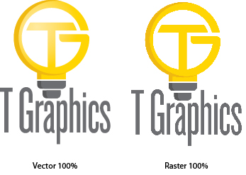
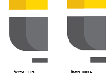
A final note. Always get your logo from your designer in vector format if possible (some logos are only done in a raster version) but if possible have it done for vector too. It's an important file to have and can save you money down the road from not having to pay other designers to redraw it over and over again. If you do have a logo that is not vector let us know and we can discuss redrawing it for you. We supply you multiple formats for different uses.
And as always if you found this helpful at all please rate the post with a star. Till next time...
Minimalist Movie Poster - 3 & 4
Minimalist Movie Poster is back! With a busy week followed by a holiday Monday I didn't get a chance to do a new poster. So this week I'll make up for it with two posters... Enjoy!#3
#4
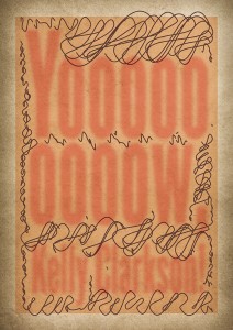 Let me know what you think by a star rating or feel free to email me and let me know which one you like best...
How To Send Large Files
Hello, First off I apologize for no post on Monday, it was Family Day so I let it slide... but will make it up with a double feature next week.
Something that comes up a lot is sharing large files. I've really only tried a few over the years so I'm not an expert but I have found a few ways that really work for me and my business. Currently I use DropBox or my internal site FTP.
Dropbox

DropBox is really great for me and my clients. My favorite feature is can create a synced desktop folder. Everything in that folder gets synced to the server and can be accessed anywhere by logging on a browser or mobile device.
It also allows you to create shared folders within that main folder. When you drop something in a shared folder it syncs to the server and then automatically pushes the file to anyone else you've chosen to share that folder with. Which is great for collaborating on projects.
Another great feature is it's public folder. By putting something in the public folder you can generate a link to a specific file for someone to access. They don't get access to anything else other then the file you've linked for them. If you don't have DropBox you can sign up here. I don't plan on doing many product endorsements (I have a few though) but I feel this is something can help a lot of my clients.
The second way I share large files is through my own server. I'd use this for larger files since DropBox does have it's limits, or if it's a regular file I need to always be accessible. I can upload and create links to anything on my end and share with a client. In order to send a large file without having dropbox this works well too. I have set up a Client FTP that clients and use to upload a file to me. I highly recommend zipping the files together before uploading multiple items. Information on zipping is available on the Client FTP page. It makes things a lot quicker and organized to receive them.
If you have any questions on setting up DropBox or using the FTP, let me know.
And as always if you found this helpful at all please rate the post with a star. Till next time...
What's Your Orientation? (File Dimensions)
In writing these Wednesday posts, I want to try and educate my clients, potential clients, or even just people who stumble across this blog. I think being informed about anything helps alleviate the worry of the unknown. I want my clients to have an understanding of what I do and be informed about design so that they know what I'm talking about on a project and not just assume what they think something means. Side note to the topic of this post, if as my client I ever say something that you aren't 100% sure what I mean, please ask.My design pet peeve... File Dimension!
When it comes to creating files I have a little pet peeve. It's not something I ever expected my clients to have really think about; They get told from a newspaper or supplier that the art dimensions are 4x6. They probably just assume, and rightfully so, that by giving me those dimensions I'll know what to design. It should be a fair assumption. In the design world dimensions should always be listed horizontal x vertical (vertical because the assumption is you are looking at your screen). Listing or stating the dimensions of a file should be something that is standardized and most industry professionals do recognize that when listing files dimensions you list the horizontal then the vertical. Unfortunately not everyone follows. For a while I just thought it was the standard and everyone else did to. However, every once in a while there is a print shop or newspaper who gives the dimensions vertical first. There isn't much that can get around it, other then just confirming orientation when receiving dimensions. But I thought it would be good to educate my clients so that they understand the information they've been given and know what to expect too.In plain english...
If the dimensions of a file are stated to be 8.5" x 11" (standard letter size), then that file is portrait orientated. If the dimensions are stated as 11" x 8.5", then that file is horizontal orientated.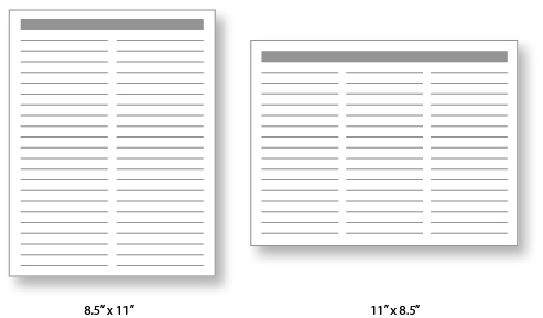 In looking up info about this to make sure I wasn't actually the one who was messing everyone else up, I found that this a common issue. Most people confirm that this is the "standard" way it should be. I even found an interesting link that shows that even big companies that should know better like, The Met Museum in New York get it wrong.
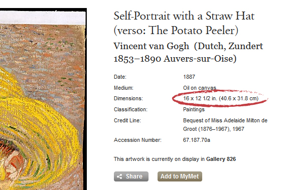 Unfortunately, it's not a problem that can just be solved by this post (I don't think the MET cares what I think on this issue). But hopefully by posting about this, you'll be aware of the implications of the dimensions you may receive. So if you ever receive dimensions that don't seem to match what you think they were going to be for the orientation, make sure you ask.
If you found this helpful at all please rate the post with a star. Till next time...
Unfortunately, it's not a problem that can just be solved by this post (I don't think the MET cares what I think on this issue). But hopefully by posting about this, you'll be aware of the implications of the dimensions you may receive. So if you ever receive dimensions that don't seem to match what you think they were going to be for the orientation, make sure you ask.
If you found this helpful at all please rate the post with a star. Till next time...Minimalist Monday - 2
Very excited to be entering week 2. Week one went well with the launch of the new site, new look and I got in my new business cards!. I appreciate everyone who's taken the time to take a look and give feed back on the site, the posts and portfolio. Keep letting me know the posts you like by giving a star rating at the bottom... that way I can tell how many people are reading, if they're interested in certain topics, or maybe not interested at all. Don't worry I can't see who gave me what star rating so you can give me one star and I won't even know it's you! But if you do feel like giving it one star I'd love to hear why.Now, on to the show...
I think what I'll do is - continue to not write the title of the movie in with the poster and then say what it was the next week... Week 1 poster was for my daughter because it was her birthday. She loves Disney princesses. So last weeks was obviously, Cinderella. Most posters will probably be obvious but I hope to start having some not so obvious ones as well. Today is not one of those days! While it's not his birthday, I thought I would post one for my son. He loves this movie!